Introducing a Cleaner, More Intuitive Settings Drawer in Akuko
by Matt Berg
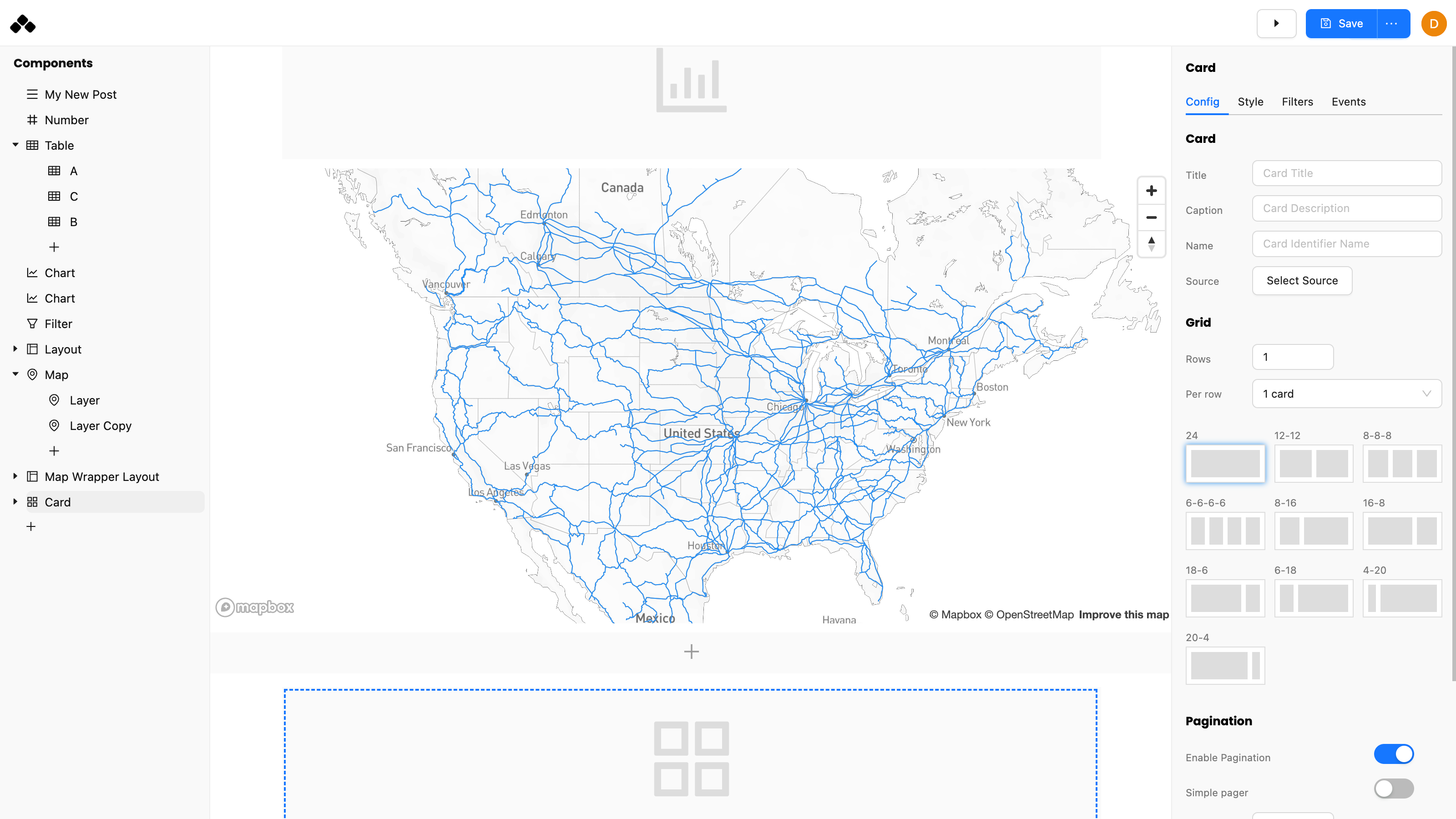
We are excited to introduce an updated version of the Akuko UI which contains a meticulously cleaned up settings drawer. This is the culmination of over a year of design iteration based on feedback from our users. We are excited by this updated version that leverages heavily on well established design patterns from tools like Figma which we love. With the new release, we believe we have struck the right balance between simplicity, advanced control with a built-in intuitiveness that users will love.
The settings are now organized into four distinct tabs: Config, Style, Filter, and Events. This reorganization ensures that you can quickly find what you're looking for without getting overwhelmed by too many options in one place.
- Config Tab: All your configuration settings are now in one place, making it simpler to adjust your visualization parameters.
- Style Tab: Style settings now get their own tab, helping to seperate form from function.
- Filter Tab: Quickly see what data filters have been applied on your component
- Events Tab: Dedicated space to manage comprehensive event based interactions

A big reason for introducing this new UI is for what we have coming next - advanced styling and design customization. With Akuko, our goal is to provide very fine grain control of how your posts look and feel. With this redesign, we've created the space to accomodate the additional required settings without overwhelming the user. We are busy working on the next part of this update and look forward to sharing more soon.
Stay tuned!


